In this post, we will discuss basic usage of matplotlib with simple and easy to understand examples. Matplotlib is a plotting library in the scipy ecosystem of libraries. Other core scipy packages include Numpy, Pandas, Sympy, IPython.
Anatomy of a matplotlib figure
Matplotlib graphs data on Figures. A matloplib figure is similar to a canvas on which we draw plot. Figure can have one or more Axes for plot, axis, title, legend, grid, ticks, ticklabels, etc. All the components of a matplotlib figure are illustrated in the figure below:

The most optimal way to create a plot is to create a figure with axes element using pyplot.subplots. Then use axes.plot() to draw data on the Axes. This is illustrated using the example code below:
A simple plot
#import packages
import matplotlib.pyplot as plt
import numpy as np
import random


# define x and y
x = [1,2,3,4,5]
y = [X**2 for X in x]

#create a figure and axes
fig, ax = plt.subplots()

#plot the data
ax.plot(x, y)

#show the plot
plt.show()

Basic Styling of Matplotlib plots
Styling a plot is as simple as calling the necessary argument inside the ax.plot() method. The important style parameters include color, linsestyle, markers etc. Color values can be a general color name like red [r], blue [b], green [g], cyan [c], magenta [m], yellow [m], black [b], white [w] or an hex code that can be easily generated online. Linestyle can be solid, dashed, dashdot, dotted, None. Check the matplolib documentation for the various marker style available.
#create a figure and an Axes
fig, ax = plt.subplots(constrained_layout=True)

#plot the data with some styling
ax.plot(x, y, color='#ff3f00', linestyle='--', marker='o')

plt.show()

Note that in the code cell above, I used constrained_layout = True when creating the figure and axes to perfectly fit the plot within the figure. It might also be necessary to set the figure size depending on the plot layout. Another simple way to style plot is using the format string fmt. fmt should be in the format [marker][line][color] using the supported marker, line and color abbreviation. I frequently use *(star), +(plus), v,<,>,^(triangele), o(circle), x(x), s(square), p(pentagon), h/H(hexagon), D/h(Diamond) or 1,2,3,4. The possible line styles format are:
-:solid line--: Dash line-.: Dash dot line:: Dotted line style
fig, ax = plt.subplots(figsize= (10,6), constrained_layout=True)

ax.plot(x, y, 'r-') #solid line with red color, no markers
ax.plot(x, [y+2 for y in y], 'g--o') #dash line with green color, circle markers
ax.plot(x, [y+4 for y in y], 'b-.s') #dash dot line with blue color, square markers
ax.plot(x, [y+6 for y in y], 'c:*') #Dotted line with cyan color, star markers
plt.show()

Labelling Plots
It is a common thing to add labels to plots for more context or information. This could be could be axis labels, text, annotation and/or legend.
set_xlabel(),set_ylabel(),set_title()are used to add text in the required locations (x axis, yaxis and title respectively)
- Other text can be directly added to the plot using
Axes.text() - We usually set legend by identifying the line or marker using Axes.legend(). This require that we set the label parameter for the ax,plot() method or we explicitly write the legend label in the
Axes.legend().
All of the above text functions return matplotlib.text.Text instance that can be customized by passing the required keyword arguments.
Other labels include ax.annotate()
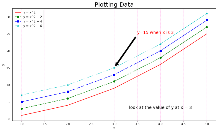
fig, ax = plt.subplots(figsize= (10,6), constrained_layout=True)

ax.plot(x, y, 'r-', label = 'y = x^2') #solid line with red color, no markers
ax.plot(x, [y+2 for y in y], 'g--o', label = 'y = x^2 + 2') #dash line with green color, circle markers
ax.plot(x, [y+4 for y in y], 'b-.s', label = 'y = x^2 + 4') #dash dot line with blue color, square markers
ax.plot(x, [y+6 for y in y], 'c:*', label = 'y = x^2 + 6') #Dotted line with cyan color, star markers

#Label the Plot
ax.set_title('Plotting Data', fontsize=20)
ax.set_xlabel('x')
ax.set_ylabel('y')
ax.text(4, 3, 'look at the value of y at x = 3', fontsize=14, ha = 'center')
ax.legend()

ax.annotate('y=15 when x is 3', xy=(3,15), xytext=(3.5,25), arrowprops=dict(facecolor='black', shrink=0.05),
color='r', fontsize=14)

ax.grid(True, color='#FF4CCE', linestyle='--', linewidth=0.5)

plt.show()

Grid of multiple plots
So far, we have been graphing our data on one axes (plot). We can make multiple subplots on a single matplolib figure. To do this, use nrows and ncols parameters of the plt.subplots() function
fig, axs = plt.subplots(nrows = 3, ncols = 2, figsize = (10,10), constrained_layout = True)

x2= np.arange(0,5, 0.1)
y2 = np.cos(2*np.pi*x2)
y3 = np.sin(2*np.pi*x2)

s = np.cos(np.linspace(0, 2*np.pi, 50))
c = np.sin(np.linspace(0, 2*np.pi, 50))


axs[0,0].plot(x,y)
axs[0,0].set_title('First Plot, row 1, col 1')

axs[0][1].plot(x, [y + 2 for y in y], 'g--o')
axs[0][1].set_title('Second Plot, row 1 col 2')

axs[1,0].plot(x2,y2, 'r-.*')
axs[1,0].set_title('Third Plot, row 2 col 1')

axs[1,1].plot(x2, y3, 'b-+')
axs[1,1].set_title('Fourth Plot, row 2 col 2')

axs[2,0].plot(c, 'g:1')
axs[2,0].set_title('Fifth Plot, row 3 col 1')

axs[2,1].plot(s, 'c:2')
axs[2,1].set_title('Sixth Plot, row 3 col 2')

fig.suptitle('Grid of multiple plots')

plt.show()

# Multiple subplots with uneven sizes in a Matplotlib Figure

fig = plt.figure(constrained_layout = True)

gspec = fig.add_gridspec(ncols=3, nrows=3)


ax0 = fig.add_subplot(gspec[0, :])
ax0.set_title('gspec[0, :]')

ax1 = fig.add_subplot(gspec[1, 0:2])
ax1.set_title('gspec[1, 0:2]')

ax2 = fig.add_subplot(gspec[1:3, -1])
ax2.set_title('gspec[1:3, -1]')

ax3 = fig.add_subplot(gspec[2, 0])
ax3.set_title('gspec[2, 0]')

ax4 = fig.add_subplot(gspec[2, 1])
ax4.set_title('gspec[2, 1]')
x = [1,2,3,4,5]
y = [1,4,9,16,25]
l1, = ax4.plot(x,y)
l1.set_label('line plot')
ax4.legend()


plt.show()

Centering axis of a plot
At times, it may be more illustrative to center the x and y axis of plots. This can be controlled by setting the position of Axes.spine element as shown below.
x = [-10, -5, 0, 5, 10]
y = [x**3 -5 for x in x]

fig, ax = plt.subplots(figsize = (6,10))
ax.plot(x,y)

ax.spines['bottom'].set_position('zero')
ax.spines['left'].set_position('zero')
ax.spines['right'].set_color('none')
ax.spines['top'].set_color('none')
plt.show()

Set X and Y limits of a plot
One method of zooming in on some section of plots is to set the x and y limits.
x = [-10, -5, 0, 5, 10]
y = [x**3 -5 for x in x]


fig, ax = plt.subplots(figsize = (6,10))
ax.plot(x,y)

#set the x and y limits
ax.set_xlim([-5, 5])
ax.set_ylim(-150, 150)

plt.xlim(-5, 5)
plt.show()

Control axis tick positions and labels
#create a list of random numbers
x = [random.randint(-10, 10) for i in range(10)]
y = [random.randint(-20, 20) for i in range(10)]

#define another function as a function of x
y2 = [-2*x +3 for x in x]

#Create a figure and axes
fig, ax = plt.subplots(figsize = (10,10))

#create a scatter plot
ax.scatter(x, y)

#create a line plot of the function y = -2x + 3
ax.plot(x, y2)

#center the axes
ax.spines['left'].set_position('zero')
ax.spines['bottom'].set_position('zero')
ax.spines['right'].set_color('none')
ax.spines['top'].set_color('none')

#set the x and y tick positions
ax.set_xticks([-10, -5, 0, 5, 10])
ax.set_yticks([-20, -10, 0, 10, 20])

#set the x and y tick labels
ax.set_xticklabels(['-ten', '-five', '0', 'five', 'ten'])

#set the legend
ax.legend(['y = -2x + 3', 'random points'])


#show the plot
plt.show()

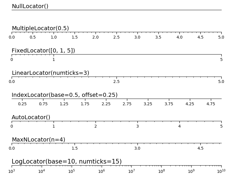
The example below shows differrent methods for setting tick locators. The different tick locators are located in the figure below.
#Conttrol axis ticks placement with ticklocators


#create a list of random numbers
x = [random.randint(-10, 10) for i in range(10)]
y = [random.randint(-20, 20) for i in range(10)]

#define another function as a function of x
y2 = [-2*x +3 for x in x]

#create a figure and axes
fig, axs = plt.subplots(ncols= 2, nrows= 2, figsize = (12,10))

#create a scatter plot and a line plot of the function y = -2x + 3 for row 0, col 0
axs[0,0].scatter(x, y)
axs[0,0].plot(x, y2)


#create a scatter plot and a line plot of the function y = -2x + 3 for row 0, col 1
axs[0,1].scatter(x, y)
axs[0,1].plot(x, y2)

#create a scatter plot and a line plot of the function y = -2x + 3 for row 1, col 0
axs[1,0].scatter(x, y)
axs[1,0].plot(x, y2)

#create a scatter plot and a line plot of the function y = -2x + 3 for row 1, col 1
axs[1,1].scatter(x, y)
axs[1,1].plot(x, y2)

#Use multipleLocator() to set x axis tick positions for row o, col o
axs[0,0].xaxis.set_major_locator(plt.MultipleLocator(4))
axs[0,0].xaxis.set_minor_locator(plt.MultipleLocator(1))
axs[0,0].set_title('Tick using MultipleLocator()')

#Use FixedLocator to set x axis tick positions for row o, col 1
axs[0,1].xaxis.set_major_locator(plt.FixedLocator([-8, -2, 0, 3, 8]))
axs[0,1].set_title('Tick using FIxedLocator()')

#Use LinearLocator() to set x axis tick positions for row 1, col 0
axs[1,0].xaxis.set_major_locator(plt.LinearLocator(4))
axs[1,0].set_title('Tick using LinearLocator()')

#Use IndexLocator() to set x axis tick positions for row 1, col 1
axs[1,1].xaxis.set_major_locator(plt.IndexLocator(base= 2, offset = -6.5))
axs[1,1].set_title('Tick using IndexLocator()')

#

#show plot
plt.show()

Export Matplotlib Figure
The code cell show how to export matplolib figure using fig.savefig()
#Export Matplotlib figure as an image or pdf in Python
import matplotlib.pyplot as plt

fig, ax = plt.subplots()

ax.plot([1,2,3,4,5], [1,4,9,16,25])
ax.plot([0,2,4,6,8], [1,4,9,16,25])


plt.show()


fig.savefig('my_figure.png')